Rockbox makes your iPod uglier
I didn’t even know that you COULD replace the software on an iPod. It’s an Apple product, right? What business do you have altering the Apple Experience?
I’ve had this little iPod Nano for several years now. As far as I’m concerned it’s the most elegant of all the iPod designs…tall, lightweight and slender, with just the right proportions. Makes my first-gen — which was the sleekest MP3 player you could get when it came out, of course — look like a brick. So I keep it around, mostly loaded up with the kind of powerful symphonic electronica that makes you want to drive above the speed limit. Still holds quite a good charge.
So when recently I got an album in FLAC (lossless) format I was saddened that I couldn’t stick it on the iPod. I could have transcoded it down to MP3, of course, but I thought hey — I wonder if FLAC actually does sound detectably different from a high-bitrate MP3? Maybe I could find some new firmware for the iPod that would add a FLAC encoder. So I looked around a bit and located this project:
Well, that was a surprise. Not just a firmware patch, but an entirely new operating system for dozens of MP3 players, the iPod foremost among them. So I downloaded and installed the new firmware and found that my iPod had suddenly gained a couple new codecs (FLAC among them), a proper graphic equalizer, a better file system, a bunch of apps — yes, really, apps — and a myriad of other interesting features. Neato!
Oh, and one other thing — it got a new interface. If you’re not familiar with the original iPod Nano interface, here it is:
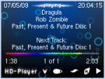
But here’s what you get when you install Rockbox:
Sigh. I give the hardware hackers enormous credit for discovering how to completely replace the operating system on what has historically been a very closed platform, but — seriously? Does this actually look “good” to anyone, anywhere? I assume that what they were going for was “functional”, but it’s not even that, because the text is miniscule and the interface doesn’t maintain internal consistency (eg: for some inexplicable reason, whether the menu button takes you back to the previous screen depends on what the previous screen was).
I’m going to stick with it for now, because I’ve found that there are some settings to increase the font size and possibly remove some of the useless extraneous information, and it appears that I can install other themes that aren’t quite as ghastly. Nevertheless, this really shouldn’t be what someone sees when they first boot up their brand-new software for their formerly well-designed MP3 player. Yuck.
It seems to me like there’s a segment of the open-source community that almost revels in ugly interfaces, implying that if an interface is too pretty it’s only for n00bs or casual users or whatever — and then there’s another segment that just adores cramming in every possible feature in a big list with no thought given to mental load. I think that Rockbox is probably the constructive interference right at the collision of the two.
At least now I can listen to the Skyrim soundtrack in the car!

